
Employee engagement analytics is the practice of converting attitudes, behaviors, and workplace data into measurable indicators HR can act on, and the single highest-leverage move is running a consistent measurement cadence and closing the feedback loop every time. Validation research behind the Flow@Work Engagement Survey, built on a sample of 39,310 employees, backs the enabler-and-indicator model most modern platforms use. Gallup's own guidance is blunter still: measurement without visible follow-through erodes trust faster than not measuring at all.
TL;DR:
- Tracking enablers like management support and development opportunities provides more actionable insights than relying on overall engagement scores alone.
- Segmenting data by team, tenure, and role reveals specific hotspots and prevents masking problems behind average scores.
- Regularly closing the feedback loop and visibly acting on engagement insights significantly boosts long-term participation and trust.
- Combining multiple data streams, including surveys, HRIS, task activity, and recognition, improves the accuracy and relevance of engagement analysis.
- Focusing on quick, targeted interventions based on driver analysis is more cost-effective than attempting comprehensive broad-based solutions.
Table of Contents
- What Employee Engagement Analytics Actually Measure
- Why Engagement Data Should Drive Real Business Decisions
- The Core Metrics and KPIs Worth Tracking
- Where the Data Comes From and How to Combine It
- How to Build an Employee Engagement Analytics Program
- Turning Scores Into Diagnoses: Analysis Methods That Work
- Common Mistakes That Quietly Sink Engagement Programs
- Leaderly in Practice: Connecting Analytics to Manager Coaching
- What Actually Separates Programs That Work From Ones That Don't
- How Leaderly Helps You Close the Loop
- Sources
What Employee Engagement Analytics Actually Measure
Engagement analytics turns fuzzy concepts like "morale" or "commitment" into numbers you can track over time, segment by team, and correlate with business results. That sounds simple. In practice, most HR teams conflate two different things: what employees feel and why they feel it.
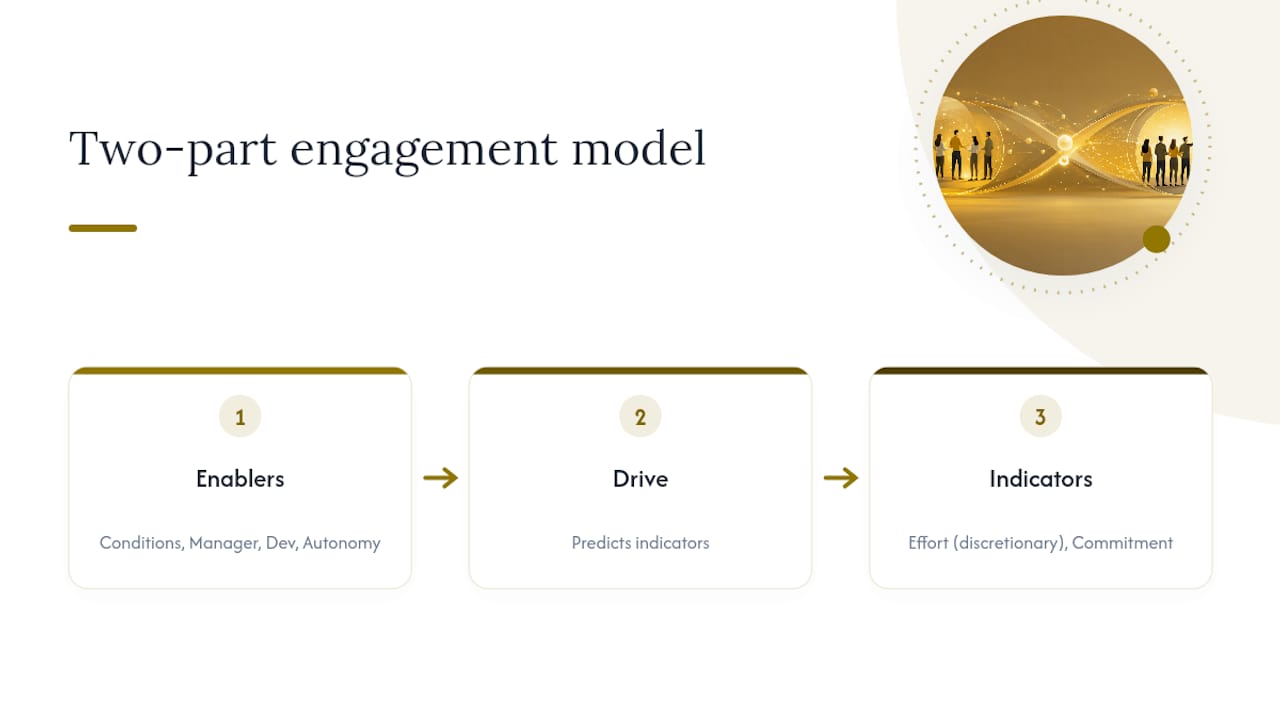
The FWES validation study offers the cleanest fix for that confusion. It models engagement as a two-part system: enablers (working conditions, manager support, development opportunities, autonomy) that predict indicators (willingness to go above and beyond, emotional commitment to the organization). Get this distinction wrong, and your dashboard tells you morale dropped in Q3 without telling you anything useful about what to fix.
The CIPD's engagement factsheet pushes this further, warning that a single composite engagement score, however clean it looks on a slide, tends to flatten out the exact detail leaders need to act. A team score of 72% might hide one manager whose direct reports are miserable and another whose team is thriving. CIPD recommends anchoring measurement in established constructs, such as the Utrecht Work Engagement Scale, rather than home-grown questions that drift in meaning year to year.
One more scope note matters here: engagement analytics identify correlation, not proof of causation. If pulse scores dip the same month a reorg happens, that is a strong signal, not a verdict. Treat every driver-analysis output as a hypothesis to test with a targeted follow-up, not a fact to broadcast in a board deck. The distinction between "engagement" and adjacent ideas like satisfaction or happiness matters too. Satisfaction asks whether people are content; engagement asks whether they are willing to put in discretionary effort. The two correlate, but they are not the same input for planning.
Why Engagement Data Should Drive Real Business Decisions
Engagement scores only matter if they move something downstream: retention, productivity, customer experience, or the return on your learning and development spend. Treating engagement analytics as an annual report card rather than an operating input is the most expensive mistake HR makes with this data.
Retention is the clearest link. Teams with declining engagement scores tend to see resignations climb in the following two to three quarters, often concentrated among tenured employees whose institutional knowledge is hardest to replace. Productivity follows a similar pattern, though it shows up faster. Disengaged teams miss deadlines, escalate fewer problems proactively, and lean harder on managers for decisions they should be making themselves.
Customer outcomes are the least obvious link and often the most persuasive one for skeptical executives. Frontline teams with low engagement scores routinely show up in customer satisfaction data before finance notices the connection. That is not a coincidence. Employees who feel unheard tend to disengage from the parts of the job that require initiative, and customer-facing initiative is exactly what a script cannot replace.
None of this pays off without action. Gallup's research on workplace surveys is direct on this point: closing the feedback loop, showing employees that their input produced a visible change, is one of the strongest levers for sustained engagement. Organizations that survey without acting train employees to stop responding honestly, which quietly poisons every future data point.

A useful way to think about ROI here: a targeted intervention, like giving a struggling manager coaching after a low team score, costs far less than replacing even one mid-level employee who leaves because nothing changed after they raised concerns. Small, visible fixes compound.
The Core Metrics and KPIs Worth Tracking
Not every metric deserves the same attention or the same frequency. Some belong on an annual baseline; others need a monthly or even weekly pulse. Here is the working set most mature engagement analytics programs build around.
- eNPS (Employee Net Promoter Score): A single "would you recommend this organization" question, useful as a fast directional signal but too blunt to diagnose root causes on its own.
- Engagement index: A composite score built from validated indicator items (commitment, willingness, advocacy), best tracked quarterly rather than monthly to avoid noise.
- Pulse survey scores: Short, frequent check-ins (3 to 5 questions) that catch shifts between annual surveys, especially after organizational changes.
- Turnover and retention rates: Segment by tenure, role, and manager. A flat company-wide number hides the teams actually bleeding talent.
- Absenteeism: Rising unplanned absence is one of the earliest behavioral proxies for disengagement, often showing up before survey scores move.
- Participation and response rates: A survey with 40% participation is not measuring your workforce; it is measuring the fraction still willing to talk to you.
- Manager effectiveness scores: Direct-report ratings of manager support and communication, since manager behavior drives more variance in engagement than almost any other single factor.
- L&D participation: Completion rates and voluntary enrollment in development programs, a strong proxy for whether employees see a future at the organization.
- Internal mobility: The rate at which open roles are filled internally, which reflects both retention health and whether development investment actually pays off.
Use baseline metrics like the annual engagement index to set direction for the year, and use pulse metrics like weekly absenteeism or short check-ins to catch problems while they are still fixable. The most common measurement pitfall across all of these is aggregating too early. A company-wide eNPS of 35 might average out a team at 70 and a team at 5. Always segment before you report.
Where the Data Comes From and How to Combine It
Good engagement analytics rarely come from a single source. The strongest programs blend at least four data streams, each catching something the others miss.
- Annual and pulse surveys capture stated attitudes, the "how do you feel" layer that behavioral data alone can't reach.
- HRIS data supplies the structural context, tenure, department, compensation band, that turns a flat score into a segmented one.
- LMS and microlearning platforms show voluntary engagement with development, which correlates strongly with retention intent.
- Recognition platform data reveals peer-to-peer engagement patterns that formal surveys almost never capture.
- Communication and behavioral usage data (meeting load, email response times, collaboration tool activity) offers an early, unfiltered signal that something is shifting before anyone says so in a survey.
Integration is where most programs stall out. The temptation is to export CSVs from each system and stitch them together manually in a spreadsheet, matching employee IDs by hand and hoping nobody made a typo. That approach breaks down fast at scale, and it introduces errors exactly where accuracy matters most. A cleaner practice is choosing systems that automatically attach metadata, tenure, department, compensation band, to every response, so drivers surface without a data team spending a week on VLOOKUPs.
On survey design itself, resist the urge to ask everything at once. A baseline survey can run 30 to 50 items across enablers and indicators once a year; a pulse survey should stay under 10. Aim for a response rate above 60% for baseline surveys to consider the data representative, and treat anything below 40% as a signal about trust, not just logistics.
Privacy and compliance deserve explicit attention, not an afterthought. Set a minimum group size, often 5 or more respondents, before reporting any segmented result, so no individual's feedback can be reverse-engineered from a small team's score. Anything smaller should roll up to the next organizational level.
How to Build an Employee Engagement Analytics Program
A working analytics program is a sequence, not a survey tool. Here is the order that actually holds up.
- Align analytics goals to business outcomes. Before writing a single survey question, decide what the program needs to move: retention in a specific business unit, manager effectiveness scores, or L&D completion rates. Vague goals like "improve culture" produce dashboards nobody uses.
- Pick your cadence. The three-pronged model, annual baseline plus regular pulses plus lifecycle-triggered feedback (onboarding, promotion, exit), gives you both depth and speed. The baseline sets direction; pulses catch drift; lifecycle surveys catch the moments where engagement is most fragile.
- Instrument your systems and define segment keys. Decide upfront which cuts matter: tenure band, department, manager, location, role level. Build these into your HRIS integration before launch, not after the first report is due.
- Run driver analysis and build prioritized action plans. Use relative weight analysis or regression to see which enablers, workload, manager support, growth opportunity, most strongly predict your indicator scores, then assign an owner and a deadline to each action item. A finding without an owner is just trivia.
- Close the loop and validate with a targeted pulse. Share results with the teams who gave the feedback, state what will change, and follow up in 60 to 90 days with a short pulse focused specifically on that change. This is the step most programs skip, and it's the one Gallup's research flags as the actual driver of sustained engagement.
Governance needs its own line item, not an afterthought. Assign a clear data owner (usually HR analytics or People Ops), set anonymization thresholds before the first survey goes out, and document who can see segmented results at what level of granularity. Managers seeing their own team's raw comments, unfiltered, tends to backfire badly.
Pro Tip: Skip the manual CSV wrangling entirely if you can. Systems that auto-attach tenure, department, and compensation metadata to every response let you spot drivers in an afternoon instead of a week, and they eliminate the copy-paste errors that quietly corrupt segmented reporting.
Turning Scores Into Diagnoses: Analysis Methods That Work
Raw scores tell you something moved. Driver analysis tells you why, and that distinction is the entire point of running analytics instead of just running surveys.
Relative weight analysis, the method underlying the FWES validation study, ranks which enablers (say, manager support versus workload versus growth opportunity) carry the most predictive weight for your indicator scores. Correlation and regression approaches work similarly but require more raw data to be reliable at the team level.
- Segment by micro-cohort, not just department. Tenure crossed with manager, or role level crossed with location, often surfaces hotspots a department-level view smooths over.
- Watch behavioral proxies alongside survey data: a drop in LMS logins or recognition-platform activity often precedes a survey score decline by weeks.
- Validate any predictive flag with a short, targeted pulse before acting on it broadly. One declining metric is a hypothesis; two or three converging signals are a pattern worth acting on.
- Build manager-facing dashboards that show trend lines and specific drivers, not just a single number, since tracking leadership growth metrics alongside engagement scores gives managers something concrete to coach against.
The FWES study's structural equation modeling, run across 39,310 respondents, found that enabler-to-indicator pathways held consistently across that global sample, which meaningfully signals that this framework generalizes beyond one company's culture. That is a stronger evidence base than most internal engagement models can claim on their own.
For presenting findings to leadership, borrow from adjacent disciplines. Practical dashboard design examples built for project reporting apply directly to engagement data: trend lines over static snapshots, drill-down by segment, and a visible "what changed since last quarter" panel.
Common Mistakes That Quietly Sink Engagement Programs
Most failed engagement analytics programs don't fail on methodology. They fail on execution habits that seem harmless until they compound.
- Survey fatigue from question overload. Keep baseline surveys to a focused 10 to 20 core items and reserve longer instruments for once a year; use 3 to 5 question pulses for everything else.
- Over-aggregation that hides root causes. A company-wide average conceals the one team dragging the whole score down. Always slice by tenure, team, and role before reporting up.
- Collecting data without visible action. Assign an owner to every finding and communicate the resulting change back to employees, even a partial one, or participation rates will erode fast.
- Bias and sampling gaps. Low response rates skew toward whoever has time and motivation to respond. Pair quantitative scores with qualitative follow-ups, focus groups or open comments, to catch what the numbers alone miss.
Leaderly in Practice: Connecting Analytics to Manager Coaching
Analytics only pay off when they route into action, and that's the gap Leaderlyapp is built to close. Its machine learning engine takes engagement and performance signals and personalizes microlessons for each employee's specific development gaps, rather than pushing the same generic training module to everyone on a team.
The real test of an engagement analytics program isn't whether the dashboard looks clean. It's whether a manager whose team is showing early disengagement signals gets a specific, actionable coaching nudge before the score drops another ten points.
Leaderlyapp's dashboards surface those signals and pair them with behavioral-science-based development content, so the loop between "we found a driver" and "we did something about it" happens in days, not the next planning cycle.
What Actually Separates Programs That Work From Ones That Don't
Here's the checklist worth pinning above your desk: set one or two specific outcome goals before you survey anything, commit to a cadence you can actually sustain, name an owner for every finding, act visibly enough that employees notice, and measure whether that action moved the metric it was meant to fix.
The part most HR teams get wrong isn't the survey design. It's assuming more data automatically means more clarity. A 60-item annual survey with no follow-through produces less genuine insight than a 5-item monthly pulse tied to a manager who actually reads it and responds. Bring in an external people scientist or vendor when your driver analysis keeps surfacing patterns nobody on the internal team has the statistical background to untangle, not before. Most engagement problems are solved by discipline in the loop, not sophistication in the model.
— Drew
How Leaderly Helps You Close the Loop
Most engagement platforms stop at the dashboard. The platform is built to pick up right where that dashboard leaves off, turning a low manager-effectiveness score or a declining team pulse into a personalized microlesson and coaching path instead of a static report nobody revisits.
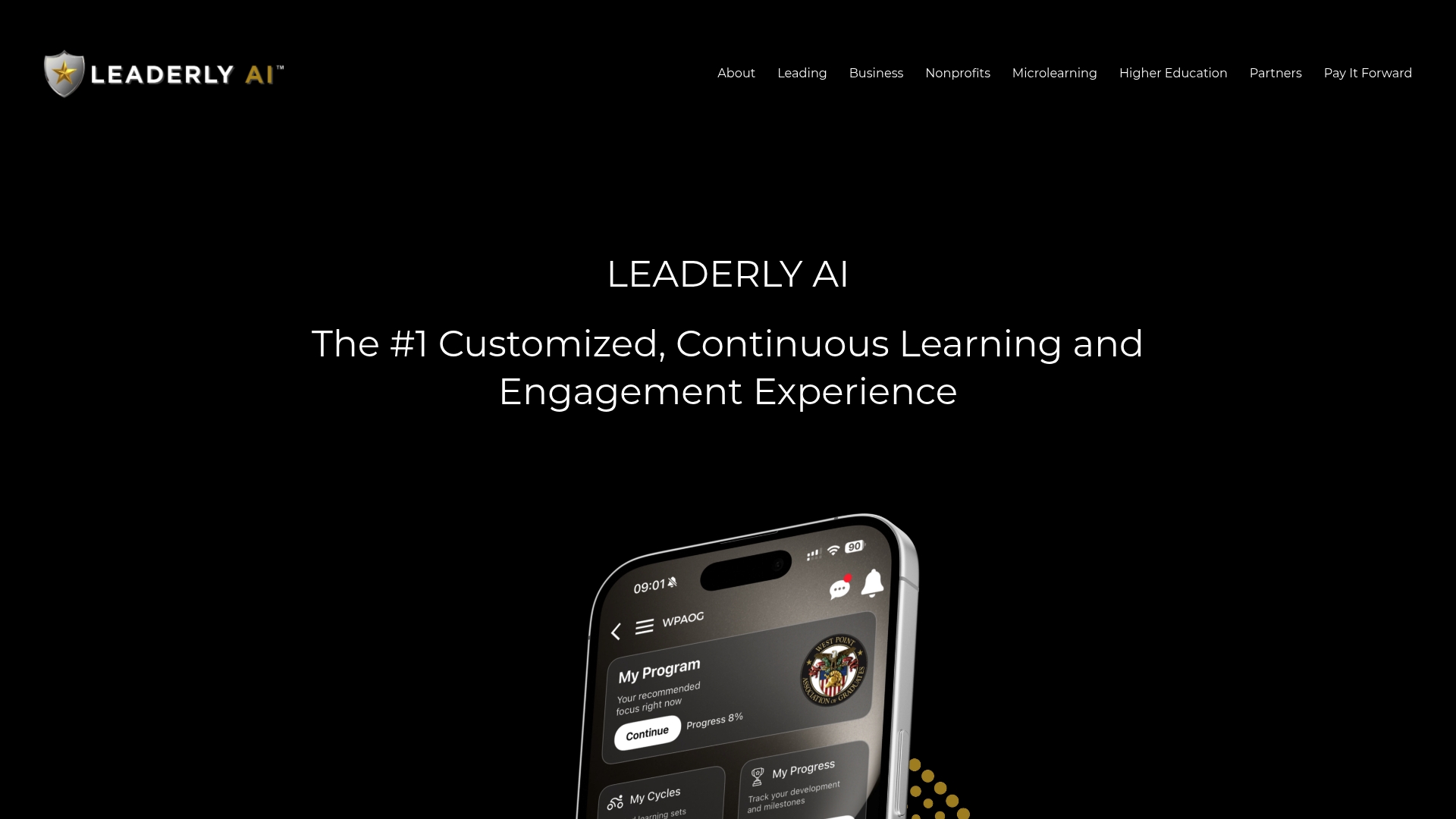
Machine learning adapts as each person's development needs shift, so the same engagement dip that shows up in your analytics gets addressed at the individual level, not with a generic all-hands training deck. For HR teams already running the baseline-plus-pulse cadence described above, that means the "close the loop" step in your playbook has an actual mechanism attached to it, rather than a checkbox nobody owns. If you're building out manager coaching workflows tied to engagement data, start with Leaderlyapp's leadership development approach to see how the analytics-to-action pipeline works, or explore strengthening people-centric leadership skills as a next step for managers flagged in your latest engagement review.
Sources
- Measuring enablers and indicators of employee engagement: Internal validity of the Flow@Work engagement survey
- Workplace employee surveys (Gallup guidance on survey best practices and closing the loop)
- Employee engagement factsheet (CIPD)
- Employee Engagement Analytics: How-To Guide For 2026 (ContactMonkey)