
Mobile learning design means building mobile-first microlearning for interruptible moments: vertical layouts, one objective per lesson, and accessibility built in from the start. Follow WCAG 2.2, lean on the 2024 systematic review and meta-analysis of what makes mobile learning succeed, and test your lessons on real phones. Leaderly AI is one example of a platform built around this approach.
TL;DR:
- Keep lessons 2 to 10 minutes, focused on one objective, with a goal, two to four steps, practice, and a job aid.
- Cache lessons for offline access, sync progress after reconnection, and test on at least one Android phone and one iPhone before launch.
- Apply WCAG 2.2 to touch targets, gestures, orientation, and media alternatives; test with screen readers and people with disabilities during the pilot.
- Favor taps and single choice questions, and provide an alternative format when timed or proctored exams are unsuitable for mobile use.
- Set completion, retention, behavior change, and satisfaction measures before a small pilot, then complete at least two build and revise cycles before expanding.
Table of Contents
- Core principles and a quick checklist for mobile-first learning design
- How do you structure a single mobile lesson and its assets?
- Which engagement tactics and assessments work on mobile?
- What does accessibility on mobile require?
- How do offline access, bandwidth, and devices shape delivery?
- What does the research say about these design choices?
- How do you test, iterate, and scale a mobile learning program?
- How can AI and machine learning personalize mobile lessons?
- Which behavioral science principles drive mobile learning engagement?
- How do you build leadership development frameworks into mobile modules?
- How do analytics and learner feedback improve mobile learning?
- What we have learned about mobile-first microlearning and leadership
- How does Leaderly AI help you deliver mobile-first learning at scale?
- FAQ
- Sources
- Authoritative sources and standards to consult
Core principles and a quick checklist for mobile-first learning design
Treat mobile as a pedagogical context, not a smaller desktop. Experts argue that designers should be trained early to work with mobile affordances instead of repurposing desktop materials. Shrinking a slide deck or PDF onto a phone screen is the classic mistake. Use responsive components like accordions and vertical stacks so a lesson reads comfortably on a single scroll.
Here is the working checklist we use before any mobile lesson ships:
- Mobile-first mindset: design for vertical scroll, one-handed use, and clear, consistent navigation.
- Microlessons: keep each lesson short, in the 2–10 minute range, with a single learning objective.
- Interruptions: save state automatically, let learners resume where they left off, and ask for minimal typing.
- Touch and visual design: use large touch targets, high contrast, legible type, and never require pinch-to-zoom.
- Media: favor short videos, always add captions and transcripts, and compress assets or use adaptive streaming.
- Assessment: build in frequent low-stakes checks with immediate feedback.
Why the emphasis on interruptions? Research on situational impairment shows that people often learn in distracting or physically restrictive settings. Simplified navigation, high-contrast visuals, and resume-state support are the design answers to that reality.
Microlearning is the backbone of this checklist. Design-based research on a micro-learning framework describes it as short, focused segments built for active, self-directed engagement, using interactive elements, gamified components, and formative assessments with immediate feedback.
Pro Tip: Open every lesson on a phone before you review it on a laptop. If you have to pinch, zoom, or scroll sideways, the lesson is not ready.
How do you structure a single mobile lesson and its assets?
A reliable lesson has a simple arc: goal, two to four micro-steps, practice, then a reflection or job aid the learner can use on the job. Everything on the screen should serve that arc. If an element does not move the learner toward the goal, cut it.
Follow these steps to build one lesson:
- State the goal in one sentence. Tell learners what they will be able to do and how long it takes, for example "Give feedback in 3 minutes."
- Break the content into two to four micro-steps. Each step gets its own screen or card, with one idea per card.
- Write tight microcopy. Use short instructions and descriptive button labels such as "Start practice" rather than "Next." Show the expected time to complete so learners can decide whether to start now or later.
- Prepare video and audio for small screens. Split long recordings into labeled segments with stated durations, add captions and transcripts, and use adaptive delivery so playback holds up on weak connections. Course design guidance from NC State recommends exactly this: short video segments with stated durations and clear, concise module names.
- Choose interactions that work with a thumb. Prefer taps and single-choice questions. Avoid precise drag-and-drop and small form fields, which are frustrating on a phone. Open edX guidance also notes that some activities, such as timed or proctored exams, are not mobile suitable, so plan an alternative format for those.
- Close with a practice or job aid. A short scenario, a checklist, or a reflection prompt turns a viewed lesson into a used skill.
If you want sample content to model your templates on, our post on leadership microlessons that run 2–7 minutes shows how topics and timings fit together. And if you are converting existing material, see how we approach turning long documents into lessons.
Which engagement tactics and assessments work on mobile?
Engagement on a phone is about earning a return visit, not holding attention for an hour. The most dependable pattern pairs microlearning with spaced practice and light nudges, so each short session builds on the last. Our write-up on combining microlearning and macrolearning covers how to plan that rhythm across weeks.
Tactics worth using:
- Spaced practice and nudges: schedule short follow-ups that revisit a skill after a gap, with a prompt that tells the learner exactly what to try.
- Sparing gamification: badges and streaks can motivate, but too many create noise. Pick one or two mechanics and tie them to real behavior, not just clicks.
- Social prompts: an occasional invitation to share a takeaway with a peer helps, as long as it is optional.
- Low-stakes formative checks: short questions with immediate feedback keep learners oriented, and branching can route people to a refresher when they miss a concept.
- Analytics that matter: track completion, replays, time on task, and signals of behavior change on the job, not only logins.
Evidence for interactivity is encouraging. A study of the i-STAR smartphone application in a pediatric nursing course found that interactive app-based learning improved student satisfaction and self-directed learning measures, and strengthened clinical reasoning readiness.
For adult audiences specifically, our guidance on engaging adult learners in leadership training offers practical ideas you can adapt to mobile.
What does accessibility on mobile require?
Accessibility on mobile starts with the standard. W3C's WCAG2Mobile guidance explains that WCAG 2.2 applies to web-based and hybrid mobile content, and it interprets the criteria for mobile concerns such as touch target size, pointer gestures, and orientation. The full WCAG 2.2 specification is the reference to keep open while you design.
What to build in:
- Touch targets and gestures: make controls large enough to tap reliably and offer a simple alternative to any complex gesture.
- Orientation: do not lock learners into one screen orientation unless the task truly requires it.
- Alternatives to media: provide captions, transcripts, and alt text for every image and video.
- Cognitive load: use clear structure, consistent navigation, and plain language so a distracted learner can still follow.
- Acceptance criteria: write accessibility into the definition of done for every lesson, not as a final polish pass.
WCAG 2.2 cannot cover every need, and the standard itself says it should be supplemented with user testing. Test with screen readers and other assistive technology, and include people with disabilities in your pilot.
Pro Tip: Turn on your phone's built-in screen reader and complete one full lesson with your eyes off the screen. You will find structure problems in minutes.
How do offline access, bandwidth, and devices shape delivery?
Real learners ride trains, wait in stairwells, and work in buildings with spotty coverage. Your design should assume the connection will drop. The 2024 systematic review recommends offline-first capabilities or graceful degradation so learners with unstable bandwidth can still complete lessons or assessments.
In practice, that means a few decisions. Cache the current lesson so it opens without a signal, and sync progress when the connection returns. Keep file sizes small, compress images, and prefer adaptive streaming for video so playback adjusts to the available bandwidth. Offer a low-bandwidth alternative, such as an audio track or a transcript, for anyone who cannot stream.

Compatibility matters just as much. Test across common devices and operating system versions, and check at least one Android phone and one iPhone before launch. Avoid layouts that need horizontal scrolling or pinch-to-zoom, and steer clear of heavy embedded frames and legacy plugins, which platform guidance specifically warns against. A practical chapter on designing for mobile learning adds a useful reminder: be mindful of image and file sizes for learners on limited data plans.
What does the research say about these design choices?
The strongest recent evidence is a 2015–2024 systematic review and meta-analysis. It found that learner engagement, device compatibility, and alignment of content to situational context are primary determinants of mobile learning success.
Microlearning and design-based research add practitioner-level support. Work on a micro-learning mobile app reported that short segments reduce cognitive load and that an interactive app approach showed higher learner satisfaction. On the visual side, research presented at CHI found that MOOC videos are often designed for desktop and suffer low readability on mobile, and it recommended adaptive visual design and context-aware accessibility support.
Taken together, the evidence points the same way as the checklist above: design around the learner, the device, and the moment.
How do you test, iterate, and scale a mobile learning program?
Treat your first release as a hypothesis. The design-based research approach works well here: analyze, construct, evaluate, redesign, then repeat, matching the design to how learners behave in real life, which tends to be fragmented and interruption-prone.
Use this rollout checklist:
- Run a small pilot. Pick one audience and a handful of lessons, and commit to at least two build-and-revise cycles.
- Set KPIs before you start. Decide how you will measure completion, retention, behavior change, and learner satisfaction so you are not choosing metrics after the fact.
- Field-test in real contexts. Ask pilot participants to learn during commutes and breaks, then collect device logs alongside interviews and open-ended feedback.
- Fix the friction you find. Prioritize problems that block completion, such as slow loads, unreadable text, or lost progress.
- Create governance for content. Assign owners, review dates, and a retirement rule so lessons do not go stale.
- Expand in waves. Scale to new audiences only after the pilot KPIs hold up.
How can AI and machine learning personalize mobile lessons?
Personalization matters more on a phone because every second of attention is scarce. The goal is simple: show each learner the next most useful lesson at the moment they are likely to open the app. Machine learning can help by using signals such as which lessons a learner finished, which they replayed, how they scored on quick checks, and when they usually study.
Start with a small set of personalization rules before reaching for anything complex. Route learners to a refresher when they miss a concept, skip content they have already mastered, and adjust the timing of reminders to their habits. Role and goal matter too: a new manager and a seasoned director should not see the same sequence on a topic like giving feedback.

Keep humans in the loop. Review what the system recommends, check that suggestions stay aligned with your learning objectives, and give learners a way to say "not relevant." Be transparent about what data you collect, and collect only what you need to improve the experience.
The 2024 systematic review points to learner engagement and alignment with situational context as primary success factors, and personalization is one of the most practical ways to act on both. It tailors the lesson to the person and to the moment, rather than asking the learner to adapt to a one-size-fits-all path.
Which behavioral science principles drive mobile learning engagement?
Learning sticks when it becomes a habit, and habits form from small, repeated actions with clear triggers. Mobile is ideal for this because the phone is already part of daily routines. Design each lesson as a tiny, repeatable action instead of a one-off event.
Four principles carry most of the weight:
Make the next step tiny. A lesson that asks for two minutes and one clear action is easier to start than one that demands a block of time. Lower the effort and more people begin.
Attach a trigger. Tie a prompt to an existing routine, such as the start of a shift or a coffee break, and send the nudge at that time. A reminder with a specific action, like "Try one thank-you message today," beats a generic "Come back and learn."
Give fast feedback. Immediate responses to a quick check help learners correct course while the idea is fresh, which is why the micro-learning framework research pairs short segments with formative low-stakes assessment.
Use rewards with restraint. Streaks and badges can reinforce a routine, but they work best when they track the behavior you actually want. Too many rewards turn into noise.
Spaced repetition ties these together. Revisit a skill after a gap, ask the learner to apply it, and let real-world practice, not screen time, be the measure of success.
How do you build leadership development frameworks into mobile modules?
Leadership is a set of behaviors practiced over time, which makes it a natural fit for short mobile lessons. The trick is to take whatever framework your organization already uses and cut it into practice-sized pieces, rather than converting a workshop into a long course.
Begin by listing the behaviors behind the framework. If it covers coaching, feedback, delegation, and decision-making, treat each as its own small track. For each behavior, write a sequence of micro-lessons: a short idea, a realistic scenario, a choice to make, and a prompt to try it with someone this week. That pattern follows the lesson blueprint described earlier: goal, micro-steps, practice, and a job aid.
Assessments help learners see where they stand. Self-assessments of style, emotional intelligence, or communication preferences give people a starting point and let you point them toward the most relevant track. Pair them with reflection questions that ask what the learner will do differently, since the real outcome is changed behavior.
Make it applicable by building in on-the-job practice. A lesson on delegation could end with a prompt to hand off one task and note what happened. Our Leadership microlessons post shows how short topics can map to leadership habits, and the same logic scales across a whole program.
How do analytics and learner feedback improve mobile learning?
Data tells you what is happening, and feedback tells you why. You need both to improve a mobile program with confidence.
Start with a small set of metrics linked to your pilot goals: completion rate, replays, time on task, drop-off points within a lesson, and the signals that suggest behavior change. Where learners abandon a lesson is often more revealing than how many finish. A sharp drop at a particular card usually points to a confusing instruction, a heavy media file, or an interaction that is hard to use on a phone.
Add qualitative input. Short in-app prompts, such as a one-tap rating and an optional comment at the end of a lesson, capture reactions while they are fresh. Follow up with a handful of interviews or observation sessions to understand the context behind the numbers, for example whether people learned on a commute or between meetings.
Close the loop on a schedule. Review the dashboard on a regular cadence, pick the top few fixes, ship them, and measure again. This mirrors the iterative cycle in design-based research. If you want a deeper look at partnering analysis with practice, our post on locking in skills shows how to connect early engagement data to longer-term outcomes.
Finally, if you manage a growing library of reference material alongside your lessons, a tool such as Omphalis lets you organize and annotate content so source materials stay easy to find as your program scales.
What we have learned about mobile-first microlearning and leadership
Here is where I land after thinking about this work: the winning mobile lesson is usually the smaller one. Designers feel pressure to prove value by adding more, but leadership growth rarely comes from more content. It comes from a single idea, tried on a real Tuesday, then repeated.
Consider a short lesson on giving feedback that ends with a prompt to use one sentence in your next one-on-one. Or a short scenario about handling a missed deadline, followed by a reminder before a team check-in. Neither is impressive on a slide. Both change what a manager does that day. That is the standard worth designing for, and it is why I think scalable leadership development belongs on the phone: it meets people inside the routines where habits actually form.
— Drew
How does Leaderly AI help you deliver mobile-first learning at scale?
Leaderly AI brings the ideas in this guide into one mobile platform: short microlessons, personalization that adapts to each learner, habit-building exercises, and analytics dashboards. We built it so HR and learning teams can focus on measurement and improvement, and so leadership development reaches every employee, not only managers.
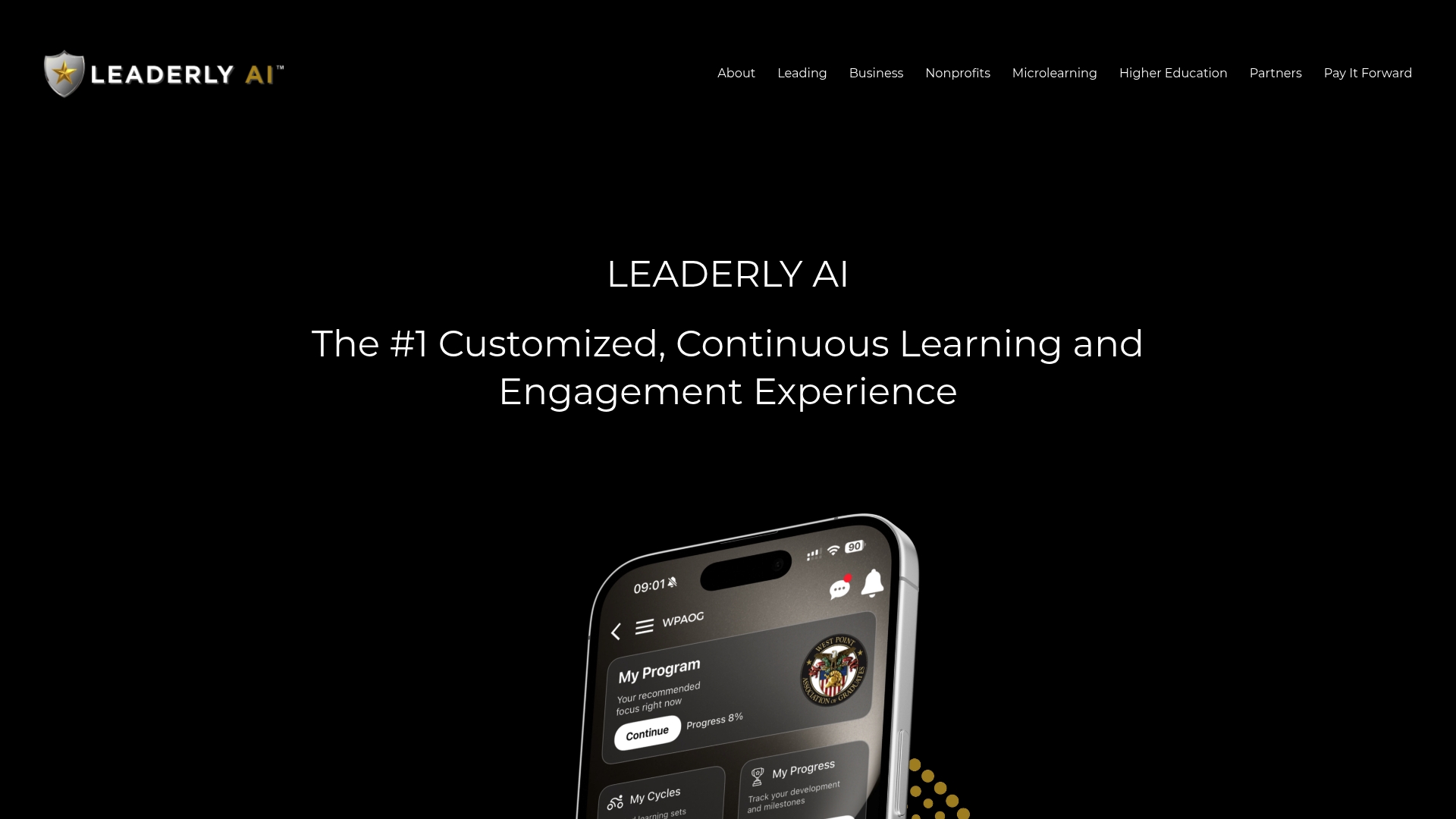
If you are planning a pilot, we would be glad to walk through how it fits your audience, whether that is a business team, a nonprofit, or a campus. Explore Leaderly AI to learn more about mobile-first microlearning.
FAQ
What is mobile-first design?
Mobile-first design means planning for the smallest screen before anything else, then adding enhancements for larger ones. For learning, that means vertical layouts, short lessons, and touch-friendly controls. Academic work on mobile-first strategies emphasizes responsive, intuitive, and context-aware learning experiences.
What is mobile learning and how does it work?
Mobile learning delivers training through smartphones and tablets so people can learn in short sessions wherever they are. Content is built in small chunks, often with interactive checks and reminders. The best programs account for interruptions, weak connections, and accessibility from the start.
What are the different types of learning design?
Common approaches include instructional models for classroom or online courses, microlearning for short focused lessons, and blended designs that combine formats. For mobile, microlearning is usually the core approach. Design-based research is a method for refining any of them through repeated testing.
What guidelines exist for designing mobile learning apps?
A 2019 usability guideline update synthesized 17 studies into practical recommendations covering content organization, layout, navigation, accessibility, and customization. Pair it with WCAG 2.2 for accessibility requirements.
Sources
- Design of a micro-learning framework and mobile application using design-based research - PMC
- Faculty
Authoritative sources and standards to consult
Start with the 2024 systematic review, then the WCAG 2.2 standard, the CHI paper on mobile MOOC video, and the design-based research study.