
A manager dashboard is a single screen that shows the metrics a team leader needs to make decisions, without hunting through five different reports. The first move that matters more than any chart choice or color scheme is picking a range of approximately eight to a dozen metrics decision-ready KPIs and assigning a named owner to each one. Everything below, the examples, the KPI framework, the build steps, the research on why some dashboards flop, builds from that one decision.
TL;DR:
- Each dashboard type should focus on a specific set of key metrics with clear ownership, targets, and decision triggers to remain actionable and relevant.
- Metrics must be directly linked to specific decisions, with a set cadence and explicit next steps; otherwise, they risk becoming meaningless decoration.
- Building effective dashboards requires a disciplined approach to data validation, visualization simplicity, governance, and iterative testing with real teams.
- Dashboards with motivational prompts and limited metrics outperform dense, comparison-heavy layouts in changing behavior and driving action.
- Using just one or two decision-critical metrics tied to real actions can vastly improve meeting efficiency and leadership focus.
Table of Contents
- What Do Good Manager Dashboards Look Like?
- How Do You Choose the Right KPIs?
- How Do You Build a Manager Dashboard Step by Step?
- Why Do Some Dashboards Fail to Change Behavior?
- What I Learned Building a Two-Metric Dashboard
- Turn Dashboard Numbers Into Leadership Habits
- Sources
- FAQ
What Do Good Manager Dashboards Look Like?
The best manager dashboards aren't generic. A frontline team leader needs different numbers than a project manager tracking a launch, and both need something different from what a VP scans before a board meeting. Here's what each version actually looks like when it's built well.
Team leader dashboard. This one tracks people and output together: task completion rate, work quality (error rate or rework percentage), and an engagement signal like participation in one-on-ones or recognition activity. Layout matters here: put trend lines next to targets, not standalone numbers, so a manager can see whether completion is climbing or sliding. Data usually comes from a project tool, a time tracker, and an engagement analytics platform. When completion drops below target, the action prompt should be explicit: "Check workload distribution before the next standup," not just a red number.
Project manager dashboard. This view centers on milestone status, open blockers, cycle time, and resource load. During standups, the dashboard should answer three questions fast: what's blocked, who's overloaded, and what moved since yesterday. A good version flags blockers older than 48 hours in a distinct color so they don't get buried in the noise.
Executive summary dashboard. Here the ClearPoint Strategy blog's guidance holds up well: cap the view at a range of approximately eight to a dozen headline metrics KPIs, each carrying an owner, a target, a trend arrow, and a drill-down path into the underlying detail. Revenue, pipeline coverage, cash position, and customer retention typically anchor this layer, with links down into the team-level dashboards that explain the "why" behind any number moving.
- Team leader: completion rate, quality/error rate, engagement signal
- Project manager: milestone status, blocker age, cycle time, resource load
- Executive: a range of approximately eight to a dozen metrics KPIs with owner, target, trend, and drill-down link
How Do You Choose the Right KPIs?
Pick metrics by working backward from a decision, not forward from whatever data happens to be easy to pull. The chain looks like this: KPI leads to a decision, which needs a target, which comes from a data source, which has an owner, which gets reviewed on a set cadence, which triggers an action. Skip any link in that chain and the metric turns into decoration.
Here's how that framework plays out across common manager functions, pairing one leading indicator (predicts what's coming) with one lagging indicator (confirms what already happened):
- Sales: Leading, qualified pipeline coverage ratio. Lagging, closed-won revenue. The leading number tells a manager whether to intervene this week; the lagging one confirms whether last quarter's coaching worked.
- Support: Leading, first-response time. Lagging, customer satisfaction score. A slipping response time predicts a satisfaction drop before it shows up in survey results.
- Operations: Leading, on-time delivery rate. Lagging, defect or return rate. Catching delivery slippage early usually prevents the defect spike that follows rushed work.
- HR and engagement: Leading, participation in development activities. Lagging, voluntary turnover. A leadership dashboard that pairs these two catch disengagement months before an exit interview.
- Product: Leading, feature adoption rate. Lagging, retention or churn. Adoption tells you whether a launch is landing; churn tells you whether it mattered.
If a metric doesn't map to a decision someone will actually make this month, move it to a report instead of the dashboard. Dashboards that try to double as archives lose the trust of the people using them.
Pro Tip: If you can't name the exact action you'd take when a KPI turns red, it doesn't belong on the dashboard. Move it to a monthly report until you can.
How Do You Build a Manager Dashboard Step by Step?
Building a dashboard that survives past month one takes more discipline than picking a template. A holistic approach, one that treats people, decisions, and technology as equally important, is what keeps a dashboard from turning into a stale archive nobody opens.
- Kickoff: Name the decisions the dashboard needs to support and who's in the room for those calls. Pick metrics only after the decisions are clear.
- Data mapping: Trace each KPI back to its source system, validate the numbers against a manual check once, and set a refresh cadence (real-time, daily, or weekly) that matches how often the decision actually gets made.
- Visualization: Favor charts that take five seconds to read: bar charts and simple trend lines rather than complex 3D pie charts or dense heat maps. Every panel shows the current value, the target, the trend direction, and the owner's name.
- Governance: Write down who updates each number, on what schedule, and where metric definitions live so two people don't calculate "active users" two different ways.
- Launch: Pilot with one team before rolling out wider, track whether people actually open it, and cut any panel nobody references after the first month.
Pro Tip: Put a last-updated timestamp on every panel. A dashboard with stale numbers and no timestamp is worse than no dashboard at all, because people make decisions on data they wrongly assume is current.
Why Do Some Dashboards Fail to Change Behavior?
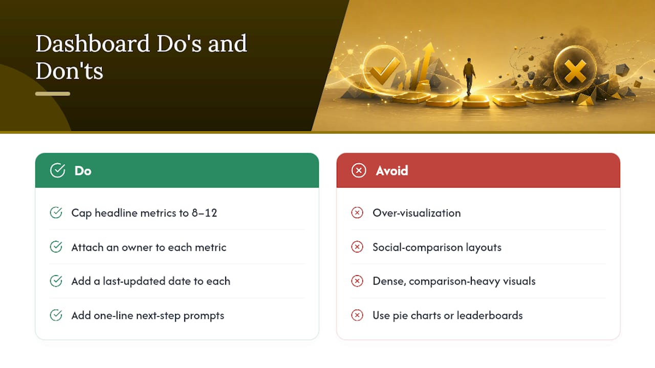
A randomized trial covering 8,745 learners found that dashboards with actionable, motivationally framed feedback increased verification rates compared to dashboards without such feedback, while dashboards showing the same data without that feedback layer produced no measurable improvement at all. The number on the screen wasn't what moved behavior. The prompt telling someone what to do about the number was.
That finding reframes what a "good" dashboard even means. A chart is not an intervention by itself; it's a trigger for one, and only if it comes packaged with a clear next step.
Over-visualization and dashboards built around social comparison can create cognitive burden and actually demotivate the people looking at them. Low-inference visuals paired with growth-oriented feedback perform better than dense, comparison-heavy layouts.
The fix is concrete: cap headline metrics at a range of approximately eight to a dozen metrics, attach an owner, and a last-updated date to each one, and write a one-line next-step prompt next to any metric that can go off track. Skip the pie charts and leaderboards that turn a dashboard into a scoreboard for shame.
What I Learned Building a Two-Metric Dashboard
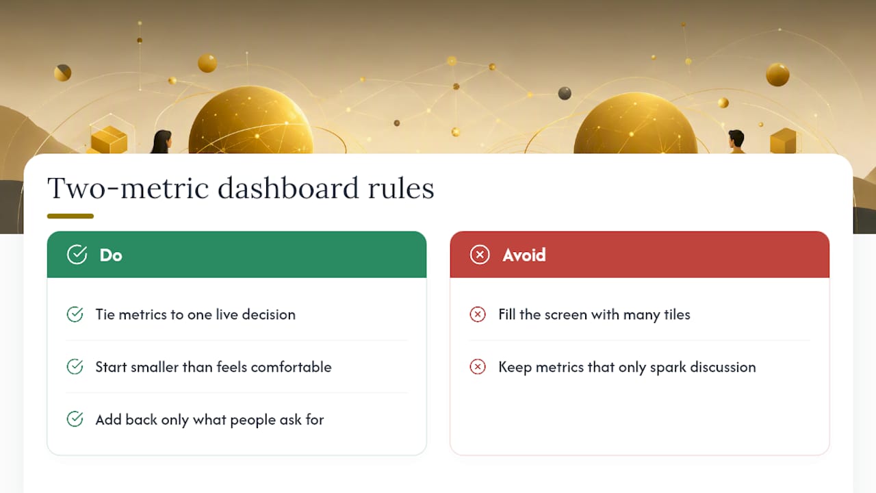
I once watched a weekly leadership meeting shrink from 90 minutes to 25 after a manager cut a 40-tile dashboard down to two numbers tied to one live decision: whether to shift headcount between two teams. Nobody missed the other 38 tiles. They'd been generating discussion, not decisions.
The takeaway holds for almost any team: a dashboard earns its screen space by answering one question fast, not by looking thorough. Start smaller than feels comfortable, then add back only what people actually ask for in the room.
— Drew
Turn Dashboard Numbers Into Leadership Habits
Watching a KPI slip tells a manager something is wrong. It doesn't tell them what to coach, or how to build the habit that fixes it. That's the gap Leaderly AI is built to close: it pairs engagement analytics with personalized microlessons, so when your dashboard flags a drop in participation or completion, the platform surfaces a practical exercise tied to that exact behavior instead of leaving you to guess.
For organizations rolling this out at scale, Leaderly AI for Business connects those engagement signals directly to leadership development content, so managers spend less time diagnosing dashboard noise and more time acting on it. If you're evaluating a pilot for your team or organization, start by exploring Leaderly AI and see how the analytics layer maps to the KPI framework you just built.
Sources
- Design principles and impact of a learning analytics dashboard: Evidence from a randomized MOOC experiment — MDPI
- 13 Executive Dashboard Examples — ClearPoint Strategy Blog
- 4 Steps to Building Management Dashboards — KMCO
FAQ
What Are the Four Types of Dashboards?
Most frameworks split dashboards into strategic (executive-level KPIs for long-term direction), analytical (deeper trend and comparison data), operational (real-time metrics for day-to-day decisions), and informational (static reporting for broad awareness).
What Are Management Dashboards?
Management dashboards give managers a unified, real-time view of KPIs across a team or function, letting them spot problems early and act before a formal review cycle.
What Are the Top Tools for Building Manager Dashboards?
There's no single best tool; the right choice depends on your data sources and team size. Business intelligence platforms handle cross-functional data blending, embedded analytics tools suit product and web metrics, and a platform like Leaderly AI pairs engagement analytics directly with leadership development content for teams that want dashboards tied to coaching action.
What Is the Five-Second Rule for Dashboards?
A dashboard should communicate its main point within about five seconds of viewing, which means using clear labels, high-contrast trend indicators, and charts that don't require interpretation to read at a glance.
Does Leaderly AI Include Manager Dashboards?
Leaderly AI includes analytics dashboards as part of its platform, pairing engagement and learning data with microlearning content so managers can act on what the numbers show; pricing details are available on the Leaderly AI site.